2D转换
转换(transform)是 CSS3 中具有颠覆性的特征之一。可以实现元素的位移、旋转、缩放等效果。
转换(transform)你可以简单理解为变形。变形就是指通过css来改变元素的形状或位置,变形不会影响到页面的布局,transform用来设置元素的变形效果。
- 移动:translate
- 旋转:rotate
- 缩放:scale
1.1 二维坐标系
2D 转换是改变标签在二维平面上的位置和形状的一种技术,先来学习二维坐标系。

2D转换之移动 translate
2D 移动是 2D 转换里面的一种功能,可以改变元素在页面中的位置,类似定位。
语法:
1
2
3
4
| transform: translate(x, y);
transform: translateX(n);
transform: translateY(n);
|
重点:
- 定义 2D 转换中的移动,沿着 X 和 Y 轴移动元素
- translate 最大的优点:不会影响到任何其他元素的位置(优于定位的地方)
- translate 中的百分比单位是相对于自身元素的 translate: (50%, 50%);
- 对行内元素没有效果
1
2
3
4
5
6
7
8
9
10
11
12
13
14
15
16
17
18
19
20
21
22
23
24
25
26
27
28
29
30
31
32
33
34
35
36
37
38
39
40
41
42
| <!doctype html>
<html lang="en">
<head>
<meta charset="UTF-8">
<meta name="viewport" content="width=device-width, initial-scale=1.0">
<meta http-equiv="X-UA-Compatible" content="ie=edge">
<title>2D转换之移动translate</title>
<style>
div {
width: 200px;
height: 200px;
background-color: hotpink;
}
div:first-child {
transform: translate(30px, 30px);
}
div:last-child {
background-color: black;
}
</style>
</head>
<body>
<div></div>
<div></div>
</body>
</html>
|
1
2
3
4
5
6
7
8
9
10
11
12
13
14
15
16
17
18
19
20
21
22
23
24
25
26
27
28
29
30
31
32
33
34
35
36
37
38
39
40
41
42
43
44
45
46
47
48
49
50
51
52
53
54
55
| <!doctype html>
<html lang="en">
<head>
<meta charset="UTF-8">
<meta name="viewport" content="width=device-width, initial-scale=1.0">
<meta http-equiv="X-UA-Compatible" content="ie=edge">
<title>让一个盒子水平居中</title>
<style>
* {
margin: 0;
padding: 0;
}
div {
position: relative;
width: 500px;
height: 500px;
background-color: hotpink;
}
p {
position: absolute;
top: 50%;
left: 50%;
width: 200px;
height: 200px;
background-color: black;
transform: translate(-50%, -50%);
}
span {
transform: translate(300px, 300px);
}
</style>
</head>
<body>
<div>
<p></p>
</div>
<span>123</span>
</body>
</html>
|
2D转换之旋转 rotate
2D 旋转指的是让元素在 2 维平面内顺时针旋转或者逆时针旋转。
语法:
重点:
- rotate 里面跟度数,单位是 deg,比如 rotate(45deg)
- 角度为正时,顺时针;负时,逆时针
- 默认旋转的中心点是元素的中心点
1
2
3
4
5
6
7
8
9
10
11
12
13
14
15
16
17
18
19
20
21
22
23
24
25
26
27
28
29
30
| <!doctype html>
<html lang="en">
<head>
<meta charset="UTF-8">
<meta name="viewport" content="width=device-width, initial-scale=1.0">
<meta http-equiv="X-UA-Compatible" content="ie=edge">
<title>2D转换之旋转rotate</title>
<style>
img {
width: 150px;
border-radius: 50%;
border: 5px solid pink;
transition: all 0.5s;
}
img:hover {
transform: rotate(360deg);
}
</style>
</head>
<body>
<img src="media/pic.jpg" alt="">
</body>
</html>
|
1
2
3
4
5
6
7
8
9
10
11
12
13
14
15
16
17
18
19
20
21
22
23
24
25
26
27
28
29
30
31
32
33
34
35
36
37
38
39
40
41
42
43
| <!doctype html>
<html lang="en">
<head>
<meta charset="UTF-8">
<meta name="viewport" content="width=device-width, initial-scale=1.0">
<meta http-equiv="X-UA-Compatible" content="ie=edge">
<title>旋转三角</title>
<style>
div {
position: relative;
width: 249px;
height: 35px;
border: 1px solid #000;
}
div::after {
content: "";
position: absolute;
top: 8px;
right: 15px;
width: 10px;
height: 10px;
border-right: 1px solid #000;
border-bottom: 1px solid #000;
transform: rotate(45deg);
transition: all 0.2s;
}
div:hover::after {
transform: rotate(225deg);
}
</style>
</head>
<body>
<div></div>
</body>
</html>
|
我们可以设置元素转换的中心点。
语法:
重点:
- 注意后面的参数 x 和 y 用空格隔开
- x y 默认转换的中心点是元素的中心点(50% 50%)
- 还可以给 x y 设置 像素 或者 方位名词(top bottom left right center)
1
2
3
4
5
6
7
8
9
10
11
12
13
14
15
16
17
18
19
20
21
22
23
24
25
26
27
28
29
30
31
32
33
| <!doctype html>
<html lang="en">
<head>
<meta charset="UTF-8">
<meta name="viewport" content="width=device-width, initial-scale=1.0">
<meta http-equiv="X-UA-Compatible" content="ie=edge">
<title>transform-origin</title>
<style>
div {
width: 100px;
height: 100px;
background-color: pink;
margin: 100px auto;
transition: all 1s;
transform-origin: 25px 25px;
}
div:hover {
transform: rotate(360deg);
}
</style>
</head>
<body>
<div></div>
</body>
</html>
|
1
2
3
4
5
6
7
8
9
10
11
12
13
14
15
16
17
18
19
20
21
22
23
24
25
26
27
28
29
30
31
32
33
34
35
36
37
38
39
40
41
42
43
44
| <!doctype html>
<html lang="en">
<head>
<meta charset="UTF-8">
<meta name="viewport" content="width=device-width, initial-scale=1.0">
<meta http-equiv="X-UA-Compatible" content="ie=edge">
<title>旋转中心点</title>
<style>
div {
overflow: hidden;
width: 200px;
height: 200px;
border: 1px solid pink;
margin: 10px;
float: left;
}
div::before {
content: "黑马";
display: block;
width: 100%;
height: 100%;
background-color: hotpink;
transform: rotate(180deg);
transform-origin: left bottom;
transition: all 0.4s;
}
div:hover::before {
transform: rotate(0deg);
}
</style>
</head>
<body>
<div></div>
<div></div>
<div></div>
</body>
</html>
|
2D 转换之缩放 scale
缩放,顾名思义,可以放大和缩小。只要给元素添加上了这个属性就能控制它放大还是缩小。
语法:
注意:
- 注意其中的 x 和 y 用逗号分隔
- transform: scale(1, 1) :宽和高都放大一倍,相当于没有放大
- transform: scale(2, 2) :宽和高都放大了 2 倍
- transform: scale(2) :只写一个参数,第二个参数默认等于第一个参数,相当于 scale(2, 2)
- transform: scale(0.5, 0.5) :缩小
- scale 缩放最大的优势:可以设置缩放的基准点(默认以中心点缩放);并且缩放不会影响其他盒子的位置(以上两个特点都是直接设置 width 和 height 都无法做到的)
1
2
3
4
5
6
7
8
9
10
11
12
13
14
15
16
17
18
19
20
21
22
23
24
25
26
27
28
29
30
31
32
33
34
35
36
37
38
39
40
41
42
43
44
45
| <!doctype html>
<html lang="en">
<head>
<meta charset="UTF-8">
<meta name="viewport" content="width=device-width, initial-scale=1.0">
<meta http-equiv="X-UA-Compatible" content="ie=edge">
<title>2D转换之缩放</title>
<style>
div {
width: 200px;
height: 200px;
background-color: pink;
margin: 100px auto;
}
div:hover {
transform: scale(2);
}
</style>
</head>
<body>
<div></div>
</body>
</html>
|
1
2
3
4
5
6
7
8
9
10
11
12
13
14
15
16
17
18
19
20
21
22
23
24
25
26
27
28
29
30
31
32
33
34
35
36
37
38
39
40
| <!doctype html>
<html lang="en">
<head>
<meta charset="UTF-8">
<meta name="viewport" content="width=device-width, initial-scale=1.0">
<meta http-equiv="X-UA-Compatible" content="ie=edge">
<title>图片放大案例</title>
<style>
div {
width: 225px;
height: 137px;
overflow: hidden;
float: left;
margin: 10px;
}
div img {
transition: all .4s;
}
div img:hover {
transform: scale(1.1);
}
</style>
</head>
<body>
<div>
<a href="#"><img src="media/scale.jpg" alt=""></a>
</div>
<div>
<a href="#"><img src="media/scale.jpg" alt=""></a>
</div>
<div>
<a href="#"><img src="media/scale.jpg" alt=""></a>
</div>
</body>
</html>
|
1
2
3
4
5
6
7
8
9
10
11
12
13
14
15
16
17
18
19
20
21
22
23
24
25
26
27
28
29
30
31
32
33
34
35
36
37
38
39
40
41
42
| <!doctype html>
<html lang="en">
<head>
<meta charset="UTF-8">
<meta name="viewport" content="width=device-width, initial-scale=1.0">
<meta http-equiv="X-UA-Compatible" content="ie=edge">
<title>Document</title>
<style>
li {
float: left;
width: 30px;
height: 30px;
border: 1px solid hotpink;
margin: 10px;
text-align: center;
line-height: 30px;
list-style: none;
border-radius: 50%;
cursor: pointer;
transition: all .4s;
}
li:hover {
transform: scale(1.2);
}
</style>
</head>
<body>
<ul>
<li>1</li>
<li>2</li>
<li>3</li>
<li>4</li>
<li>5</li>
<li>6</li>
<li>7</li>
</ul>
</body>
</html>
|
2D 转换综合写法
注意:
- 同时使用多个转换,其格式为:
transform: translate() rotate() scale() …等
- 其顺序会影转换的效果。(先旋转会改变坐标轴方向)
- 当我们同时有位移和其他属性的时候,记得要将位移放到最前
1
2
3
4
5
6
7
8
9
10
11
12
13
14
15
16
17
18
19
20
21
22
23
24
25
26
27
28
29
| <!doctype html>
<html lang="en">
<head>
<meta charset="UTF-8">
<meta name="viewport" content="width=device-width, initial-scale=1.0">
<meta http-equiv="X-UA-Compatible" content="ie=edge">
<title>Document</title>
<style>
div {
width: 200px;
height: 200px;
background-color: pink;
transition: all 1s;
}
div:hover {
transform: translate(150px, 50px) rotate(180deg) scale(1.2);
}
</style>
</head>
<body>
<div></div>
</body>
</html>
|
2D 转换总结
- 转换 transform 我们简单理解就是变形,有 2D 和 3D 之分
- 我们暂且学了三个,分别是:位移、旋转 和 缩放
- 2D 移动 translate(x, y) 最大的优势是不影响其他盒子,里面参数用 %,是相对于自身宽度和高度来计算的
- 可以分开写比如 translateX(x) 和 translateY(y)
- 2D 旋转 rotate(度数) 可以实现旋转元素,度数的单位是 deg
- 2D 缩放 sacle(x, y) 里面参数是数字,不跟单位,可以是小数。最大的优势在于不影响其他盒子
- 设置转换中心点 transform-origin : x y; 参数可以百分比、像素或者是方位名词
- 当我们进行综合写法,同时有位移和其他属性的时候,记得要将位移放到最前
3D转换
我们生活的环境是 3D 的,照片就是 3D 物体在 2D 平面呈现的例子。
有什么特点
当我们在网页上构建 3D 效果的时候参考这些特点就能产出 3D 效果。
三维坐标系
三维坐标系其实就是指立体空间,立体空间是由3个轴共同组成的。
- x 轴:水平向右(注意:x 右边是正值,左边是负值)
- y 轴:垂直向下(注意:y 下面是正值,上面是负值)
- z 轴:垂直屏幕(注意:往外面是正值,往里面是负值)
3D 转换我们主要学习工作中最常用的 3D 位移 和 3D 旋转。
主要知识点
- 3D 位移:translate3d(x, y, z)
- 3D 旋转:rotate3d(x, y, z)
- 透视:perspective
- 3D 呈现:transfrom-style
3D移动 translate3d
3D 移动在 2D 移动的基础上多加了一个可以移动的方向,就是 z 轴方向。
- transform:translateX(100px):仅仅是在 X 轴上移动
- transform:translateY(100px):仅仅是在 Y 轴上移动
- transform:translateZ(100px):仅仅是在 Z 轴上移动(注意:translateZ 一般用 px 单位)
- transform:translate3d(x, y, z):其中 x、y、z 分别指要移动的轴的方向的距离
因为 z 轴是垂直屏幕,由里指向外面,所以默认是看不到元素在 z 轴的方向上移动(要借助透视)。
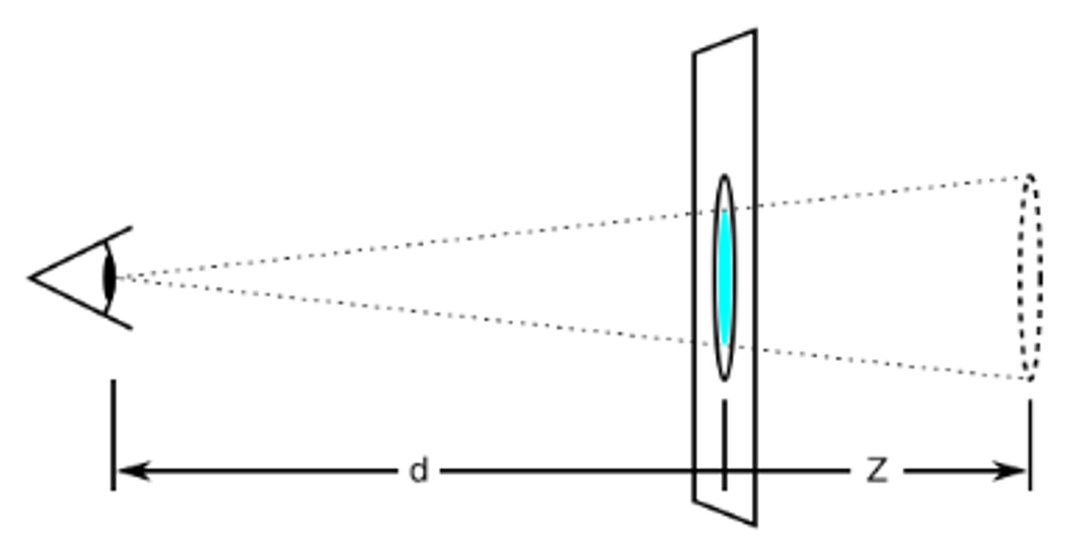
3D透视 perspective
在 2D 平面产生近大远小视觉立体,但是效果只是二维的。
- 如果想要在网页产生 3D 效果需要透视(理解成 3D 物体投影在 2D 平面内)
- 模拟人类的视觉位置,可认为安排一只眼睛去看
- 透视我们也称为视距:视距就是人的眼睛到屏幕的距离
- 距离视觉点越近的,在电脑平面成像越大,越远成像越小
- 透视的单位是像素
透视写在被观察元素的父盒子上面。
d:就是视距,视距就是一个距离人的眼睛到屏幕的距离。
z:就是 z 轴,物体距离屏幕的距离,z 轴越大(正值)我们看到的物体就越大。
1
2
3
4
5
6
7
8
9
10
11
12
13
14
15
16
17
18
19
20
21
22
23
24
25
26
27
28
29
30
31
32
33
34
35
36
| <!doctype html>
<html lang="en">
<head>
<meta charset="UTF-8">
<meta name="viewport" content="width=device-width, initial-scale=1.0">
<meta http-equiv="X-UA-Compatible" content="ie=edge">
<title>3D移动translate3d</title>
<style>
body {
perspective: 200px;
}
div {
width: 200px;
height: 200px;
background-color: pink;
transform: translate3d(400px, 100px, 100px);
}
</style>
</head>
<body>
<div></div>
</body>
</html>
|
3DtranslateZ
translform:translateZ(100px):仅仅是在 Z 轴上移动。有了透视,就能看到 translateZ 引起的变化了。
- translateZ:近大远小
- translateZ:往外是正值
- translateZ:往里是负值
1
2
3
4
5
6
7
8
9
10
11
12
13
14
15
16
17
18
19
20
21
22
23
24
25
26
27
28
29
30
| <!doctype html>
<html lang="en">
<head>
<meta charset="UTF-8">
<meta name="viewport" content="width=device-width, initial-scale=1.0">
<meta http-equiv="X-UA-Compatible" content="ie=edge">
<title>translateZ</title>
<style>
body {
perspective: 500px;
}
div {
width: 200px;
height: 200px;
background-color: pink;
margin: 100px auto;
transform: translateZ(0);
}
</style>
</head>
<body>
<div></div>
<div></div>
<div></div>
</body>
</html>
|
3D旋转 rotate3d
3D旋转指可以让元素在三维平面内沿着 x轴,y轴,z轴或者自定义轴进行旋转。
语法
- transform: rotateX(45deg):沿着 x 轴正方向旋转 45 度
- transform: rotateY(45deg):沿着 y 轴正方向旋转 45deg
- transform: rotateZ(45deg):沿着 z 轴正方向旋转 45deg
- transform: rotate3d(x, y, z, deg):沿着自定义轴旋转 deg 为角度(了解即可)
对于元素旋转的方向的判断,我们需要先学习一个左手准则。
左手准则
- 左手的手拇指指向 x 轴的正方向
- 其余手指的弯曲方向就是该元素沿着 x 轴旋转的方向
1
2
3
4
5
6
7
8
9
10
11
12
13
14
15
16
17
18
19
20
21
22
23
24
25
26
27
28
29
30
31
| <!doctype html>
<html lang="en">
<head>
<meta charset="UTF-8">
<meta name="viewport" content="width=device-width, initial-scale=1.0">
<meta http-equiv="X-UA-Compatible" content="ie=edge">
<title>rotateX</title>
<style>
body {
perspective: 300px;
}
img {
display: block;
margin: 100px auto;
transition: all 1s;
}
img:hover {
transform: rotateX(45deg);
}
</style>
</head>
<body>
<img src="media/pig.jpg" alt="">
</body>
</html>
|
- 左手的手拇指指向 y 轴的正方向
- 其余手指的弯曲方向就是该元素沿着 y 轴旋转的方向(正值)
1
2
3
4
5
6
7
8
9
10
11
12
13
14
15
16
17
18
19
20
21
22
23
24
25
26
27
28
29
| <!doctype html>
<html lang="en">
<head>
<meta charset="UTF-8">
<meta name="viewport" content="width=device-width, initial-scale=1.0">
<meta http-equiv="X-UA-Compatible" content="ie=edge">
<title>rotateY</title>
<style>
body {
perspective: 500px;
}
img {
display: block;
margin: 100px auto;
transition: all 1s;
}
img:hover {
transform: rotateY(45deg);
}
</style>
</head>
<body>
<img src="media/pig.jpg" alt="">
</body>
</html>
|
1
2
3
4
5
6
7
8
9
10
11
12
13
14
15
16
17
18
19
20
21
22
23
24
25
26
27
28
29
30
| <!doctype html>
<html lang="en">
<head>
<meta charset="UTF-8">
<meta name="viewport" content="width=device-width, initial-scale=1.0">
<meta http-equiv="X-UA-Compatible" content="ie=edge">
<title>rotateZ</title>
<style>
body {
perspective: 500px;
}
img {
display: block;
margin: 100px auto;
transition: all 1s;
}
img:hover {
transform: rotateZ(180deg);
}
</style>
</head>
<body>
<img src="media/pig.jpg" alt="">
</body>
</html>
|
transform: rotate3d(x, y, z, deg):沿着自定义轴旋转 deg 为角度(了解即可)。
xyz 是表示旋转轴的矢量,表示你是否希望沿着该轴旋转,最后一个表示旋转的角度。
- transform: rotate3d(1, 0, 0, 45deg):就是沿着 x 轴旋转 45deg
- transform: rotate3d(0, 1, 0, 45deg):就是沿着 y 轴旋转 45deg
- transform: rotate3d(0, 0, 1, 45deg):就是沿着 z 轴旋转 45deg
- transform: rotate3d(1, 1, 0, 45deg):就是沿着对角线(矢量计算)旋转 45deg
1
2
3
4
5
6
7
8
9
10
11
12
13
14
15
16
17
18
19
20
21
22
23
24
25
26
27
28
29
30
31
32
33
| <!doctype html>
<html lang="en">
<head>
<meta charset="UTF-8">
<meta name="viewport" content="width=device-width, initial-scale=1.0">
<meta http-equiv="X-UA-Compatible" content="ie=edge">
<title>rotate3d</title>
<style>
body {
perspective: 500px;
}
img {
display: block;
margin: 100px auto;
transition: all 1s;
}
img:hover {
transform: rotate3d(1, 1, 0, 45deg);
}
</style>
</head>
<body>
<img src="media/pig.jpg" alt="">
</body>
</html>
|
3D呈现 transfrom-style
- 控制子元素是否开启三维立体环境
- transform-style: flat 子元素不开启 3d 立体空间(默认的)
- transform-style: preserve-3d; 子元素开启立体空间
- 代码写给父级,但是影响的是子盒子
- 这个属性很重要,后面必用
1
2
3
4
5
6
7
8
9
10
11
12
13
14
15
16
17
18
19
20
21
22
23
24
25
26
27
28
29
30
31
32
33
34
35
36
37
38
39
40
41
42
43
44
45
46
47
48
49
50
51
| <!doctype html>
<html lang="en">
<head>
<meta charset="UTF-8">
<meta name="viewport" content="width=device-width, initial-scale=1.0">
<meta http-equiv="X-UA-Compatible" content="ie=edge">
<title>transform-style</title>
<style>
body {
perspective: 500px;
}
.box {
position: relative;
width: 200px;
height: 200px;
margin: 100px auto;
transition: all 2s;
transform-style: preserve-3d;
}
.box:hover {
transform: rotateY(60deg);
}
.box div {
position: absolute;
top: 0;
left: 0;
width: 100%;
height: 100%;
background-color: pink;
}
.box div:last-child {
background-color: purple;
transform: rotateX(60deg);
}
</style>
</head>
<body>
<div class="box">
<div></div>
<div></div>
</div>
</body>
</html>
|
【案例:两面翻转的盒子】
实现步骤:
- 搭建 HTML 结构
1
2
3
4
| <div class="box">
<div class="front">黑马程序员</div>
<div class="back">pink老师等你</div>
</div>
|
- box 父盒子里面包含前后两个子盒子
- box 是翻转的盒子 front 是前面盒子 back 是后面盒子
- CSS 样式
- box 指定大小,切记要添加 3d 呈现
- back 盒子要沿着 Y 轴翻转 180 度
- 最后鼠标经过 box 沿着 Y 旋转 180deg
代码:
1
2
3
4
5
6
7
8
9
10
11
12
13
14
15
16
17
18
19
20
21
22
23
24
25
26
27
28
29
30
31
32
33
34
35
36
37
38
39
40
41
42
43
44
45
46
47
48
49
50
51
52
53
54
55
56
57
58
59
60
61
62
| <!doctype html>
<html lang="en">
<head>
<meta charset="UTF-8">
<meta name="viewport" content="width=device-width, initial-scale=1.0">
<meta http-equiv="X-UA-Compatible" content="ie=edge">
<title>两面翻转的盒子</title>
<style>
body {
perspective: 400px;
}
.box {
position: relative;
width: 300px;
height: 300px;
margin: 100px auto;
transition: all .4s;
transform-style: preserve-3d;
}
.box:hover {
transform: rotateY(180deg);
}
.front,
.back {
position: absolute;
top: 0;
left: 0;
width: 100%;
height: 100%;
border-radius: 50%;
font-size: 30px;
color: #fff;
text-align: center;
line-height: 300px;
}
.front {
background-color: pink;
z-index: 1;
}
.back {
background-color: purple;
transform: rotateY(180deg);
}
</style>
</head>
<body>
<div class="box">
<div class="front">黑马程序员</div>
<div class="back">pink老师这里等你</div>
</div>
</body>
</html>
|
【案例:3D 导航栏】
实现步骤:
- 搭建 HTML 结构
1
2
3
4
5
6
7
8
| <ul>
<li>
<div class="box">
<div class="front">黑马程序员</div>
<div class="bottom">pink老师等你</div>
</div>
</li>
</ul>
|
- li 做导航栏
- .box 是翻转的盒子 front 是前面盒子 bottom 是底下盒子
- CSS 样式
- li 设置大小,加透视和 3d 呈现
- front 需要前移 17.5 像素
- bottom 需要下移 17.5 像素并且要沿着 x 轴翻转 负 90 度
- 鼠标放到 box 让盒子旋转 90 度
1
2
3
4
5
6
7
8
9
10
11
12
13
14
15
16
17
18
19
20
21
22
23
24
25
26
27
28
29
30
31
32
33
34
35
36
37
38
39
40
41
42
43
44
45
46
47
48
49
50
51
52
53
54
55
56
57
58
59
60
61
62
63
64
65
66
67
68
69
70
71
72
73
74
75
76
77
78
79
80
81
82
83
84
85
86
87
88
89
90
91
92
93
94
95
96
97
98
99
100
101
102
103
104
105
106
| <!doctype html>
<html lang="en">
<head>
<meta charset="UTF-8">
<meta name="viewport" content="width=device-width, initial-scale=1.0">
<meta http-equiv="X-UA-Compatible" content="ie=edge">
<title>3D导航栏案例</title>
<style>
* {
margin: 0;
padding: 0;
}
ul {
margin: 100px;
}
ul li {
float: left;
margin: 0 5px;
width: 120px;
height: 35px;
list-style: none;
perspective: 500px;
}
.box {
position: relative;
width: 100%;
height: 100%;
transform-style: preserve-3d;
transition: all .4s;
}
.box:hover {
transform: rotateX(90deg);
}
.front,
.bottom {
position: absolute;
left: 0;
top: 0;
width: 100%;
height: 100%;
}
.front {
background-color: pink;
z-index: 1;
transform: translateZ(17.5px);
}
.bottom {
background-color: purple;
transform: translateY(17.5px) rotateX(-90deg);
}
</style>
</head>
<body>
<ul>
<li>
<div class="box">
<div class="front">黑马程序员</div>
<div class="bottom">pink老师等你</div>
</div>
</li>
<li>
<div class="box">
<div class="front">黑马程序员</div>
<div class="bottom">pink老师等你</div>
</div>
</li>
<li>
<div class="box">
<div class="front">黑马程序员</div>
<div class="bottom">pink老师等你</div>
</div>
</li>
<li>
<div class="box">
<div class="front">黑马程序员</div>
<div class="bottom">pink老师等你</div>
</div>
</li>
<li>
<div class="box">
<div class="front">黑马程序员</div>
<div class="bottom">pink老师等你</div>
</div>
</li>
<li>
<div class="box">
<div class="front">黑马程序员</div>
<div class="bottom">pink老师等你</div>
</div>
</li>
</ul>
</body>
</html>
|
【综合案例:旋转木马】
- 搭建 HTML 结构
1
2
3
4
5
6
7
8
| <section>
<div></div>
<div></div>
<div></div>
<div></div>
<div></div>
<div></div>
</section>
|
- 里面的 6 个 div 分别是 6 个狗狗图片
- 注意最终旋转是 section 标签旋转
- CSS 样式
- 给 body 添加 透视效果 perspective: 1000px;
- 给 section 添加大小,一定不要忘记添加 3d 呈现效果控制里面的 6 个 div
- 里面 6 个 div 全部绝对定位叠到一起,然后移动不同角度旋转和距离
- 注意:旋转角度用 rotateY 距离肯定用 translateZ 来控制
- 给 section 添加动画 animation,让它可以自动旋转即可
1
2
3
4
5
6
7
8
9
10
11
12
13
14
15
16
17
18
19
20
21
22
23
24
25
26
27
28
29
30
31
32
33
34
35
36
37
38
39
40
41
42
43
44
45
46
47
48
49
50
51
52
53
54
55
56
57
58
59
60
61
62
63
64
65
66
67
68
69
70
71
72
73
74
75
76
77
78
79
80
81
82
83
84
85
86
87
88
89
90
| <!doctype html>
<html lang="en">
<head>
<meta charset="UTF-8">
<meta name="viewport" content="width=device-width, initial-scale=1.0">
<meta http-equiv="X-UA-Compatible" content="ie=edge">
<title>综合案例:旋转木马</title>
<style>
body {
perspective: 1000px;
}
section {
position: relative;
width: 300px;
height: 200px;
margin: 150px auto;
transform-style: preserve-3d;
animation: rotate 10s linear infinite;
background: url(media/pig.jpg) no-repeat;
}
section:hover {
animation-play-state: paused;
}
@keyframes rotate {
0% {
transform: rotateY(0);
}
100% {
transform: rotateY(360deg);
}
}
section div {
position: absolute;
top: 0;
left: 0;
width: 100%;
height: 100%;
background: url(media/dog.jpg) no-repeat;
}
section div:nth-child(1) {
transform: rotateY(0) translateZ(300px);
}
section div:nth-child(2) {
transform: rotateY(60deg) translateZ(300px);
}
section div:nth-child(3) {
transform: rotateY(120deg) translateZ(300px);
}
section div:nth-child(4) {
transform: rotateY(180deg) translateZ(300px);
}
section div:nth-child(5) {
transform: rotateY(240deg) translateZ(300px);
}
section div:nth-child(6) {
transform: rotateY(300deg) translateZ(300px);
}
</style>
</head>
<body>
<section>
    <div></div>
    <div></div>
    <div></div>
    <div></div>
    <div></div>
    <div></div>
</section>
</body>
</html>
|
浏览器私有前缀
浏览器私有前缀是为了兼容老版本的写法,比较新版本的浏览器无须添加。
私有前缀
- -moz-:代表 firefox 浏览器私有属性
- -ms-:代表 ie 浏览器私有属性
- -webkit-:代表 safari、chrome 私有属性
- -o-:代表 Opera 私有属性
提倡的写法
1
2
3
4
| -moz-border-radius: 10px;
-webkit-border-radius: 10px;
-o-border-radius: 10px;
border-radius: 10px;
|
以后通过构建工具来自动加这些属性
过渡 动画
移动Web开发之流式布局